
Book covers
Where Typography Meets Tale: Original Book covers with a Twist
Overview
Books possess a remarkable ability to transport readers to entirely new worlds—whether it be the distant reaches of space or the war-torn fields of France during World War II. What makes this so powerful is that it’s achieved purely through words. Through vivid description and storytelling, authors are able to craft immersive environments that feel both real and imaginative at the same time.
This project intended to create that same sense of storytelling, using design as the medium. The objective was to create three distinct book covers for a book or film of our choice, reimagining and redesigning it from scratch. Using the principles and techniques learned in Typography 1, the focus was to demonstrate a strong understanding of typographic hierarchy and structure, while bringing an original perspective to a familiar piece of media.
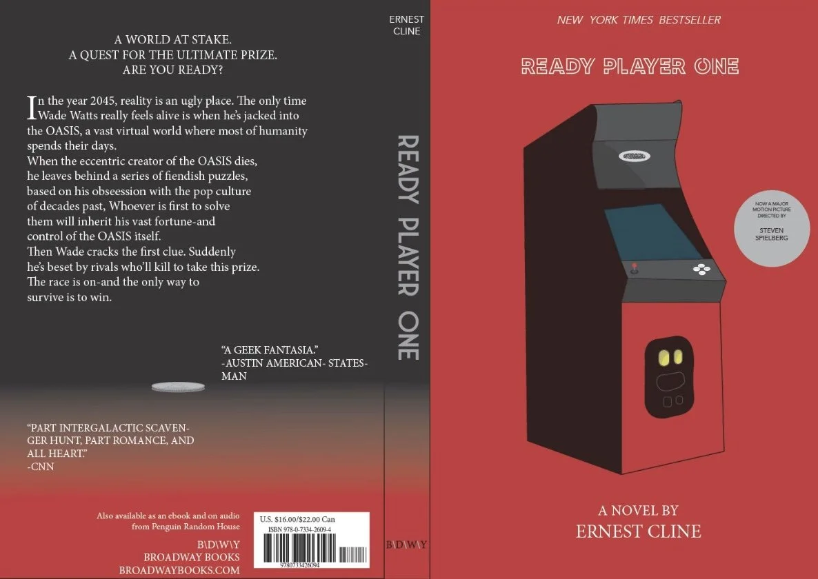
First cover- Vintage Arcade & Quarter
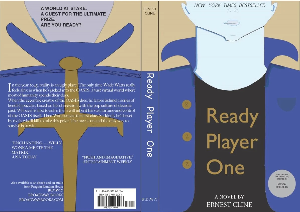
Second cover- Parzival's Jacket & torso
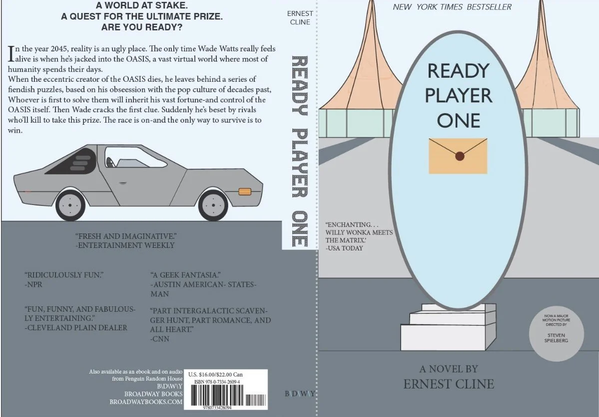
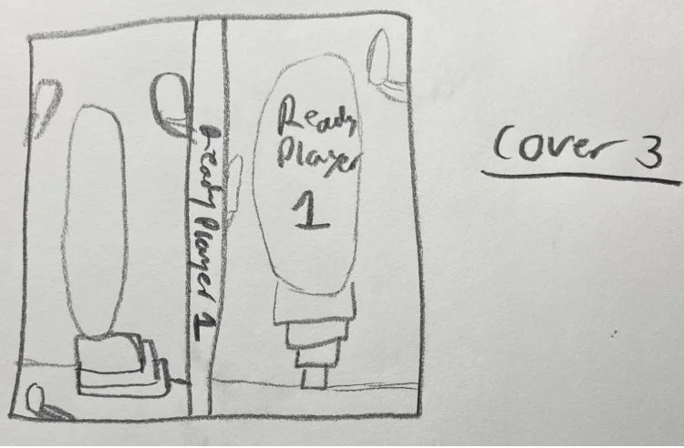
Third cover- Portal inside Main Oasis hub & Delorean
Design process
Research & Discovery
To start, I brainstormed several of my favorite books and films to determine which ones offered the most visual inspiration. Initially, I considered Warcross by Marie Lu; however, after exploring the concept further, I felt it did not offer enough creative potential for me to fully commit to.
I ultimately chose Ready Player One by Ernest Cline, a book I’ve always appreciated for its deep roots in pop culture. Its wide range of references and vivid descriptions offered me many different choices to focus on in my redesign.
From there, I narrowed my ideas to three main visuals: the protagonist’s jacket, a quarter under a spotlight, and a portal within the OASIS—each representing key moments or have symbolic references from the book.


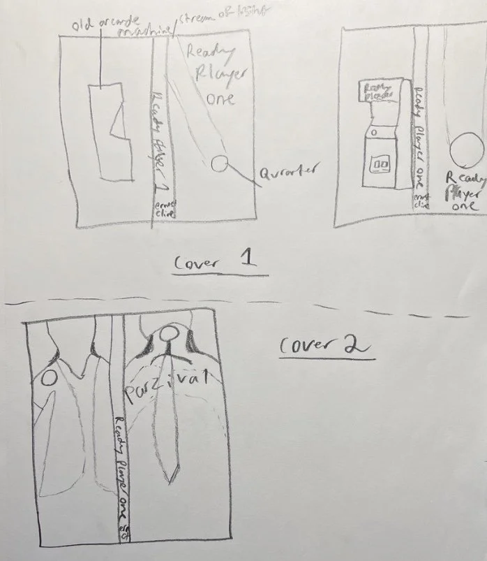
Sketches & Ideation
Below are some initial sketches to explore the layout, structure, and composition, considering which elements I want emphasis on in the front, spine, and back. This stage helped solidify the direction for each version of the cover and allowed me to visualize how each element would interact across all the covers and what I needed to revise.
Color Palette & Style Choices
The first cover featured an old arcade machine on the front, a nod to the book’s retro-gaming influence, with the quarter moved to the back. I used a red and black color scheme to evoke a nostalgic tone, along with white and gray type for clarity and contrast.
This design focused on the protagonist’s iconic jacket. The palette centered on shades of blue and gold to mimic denim and embroidered patches, conveying a rugged, rebellious tone. I added some small facial features, but I did not make them prominent to keep attention on the jacket itself, allowing it to serve as a strong visual symbol.
The final version focused on a portal inside the OASIS, with the design incorporating softer, lighter tones such as grays, blues, and tans to evoke a sense of mystery and wonder. I also included a hand-drawn image of the DeLorean from Back to the Future on the back cover and positioned a floating envelope at the center of the portal, both referencing key plot elements.
Final poster explanations
After revising the layout for the first cover, I chose to feature the arcade machine on the front for greater emphasis and moved the quarter to the back cover. The typography for the title was chosen to reflect a retro yet modern feel, while simpler, clean fonts were used for body and secondary text to maintain a clear hierarchy and support legibility.
This version emphasized the protagonist’s jacket as a symbol of identity and rebellion. I included details such as custom buttons shaped like “Z” and a small chest pocket were added to give depth. The sword design on the back references Parzival’s name and ties into his quest for the virtual Holy Grail, adding narrative weight to the visuals.
For the final design, the portal scene was brought to life with the DeLorean placed on the back, reinforcing the book’s deep pop culture roots. The envelope within the portal references key riddles found throughout the story and serves as a focal point to draw the viewer in. The typography along the spine was chosen to complement the metallic, futuristic elements of the design, uniting the cover to be complete.