Dashboard design
Cannabis dashboard
Overview
Dashboards are powerful tools designed to present key information in a clear and visually engaging manner, allowing for quick and intuitive understanding. This project focused on designing a dashboard centered around a topic of personal interest, with the goal of presenting meaningful data through compelling visuals.
I chose to explore the cannabis industry—a field with a complex and often controversial history. While it has long been associated with criminalization and stigma, recent years have seen a growing number of states reevaluate and roll back restrictive policies. This shift marks a significant transformation in public perception and legislation, making it a timely and relevant subject for data visualization.
Design process
Research

To begin this project, I started to research and identify ideas that would be both impactful and manageable within the project’s timeline. After exploring several possibilities, I decided to develop a data-driven dashboard focused on cannabis sales and demographic trends across different states.
My initial plan was to analyze Massachusetts in comparison with Connecticut and Florida. However, as my research progressed, I refined the scope to focus exclusively on New England states that have legalized cannabis for both medical and recreational use. This shift allowed for a more relevant and cohesive regional comparison, offering clearer insights into legalization trends and their socioeconomic impact.
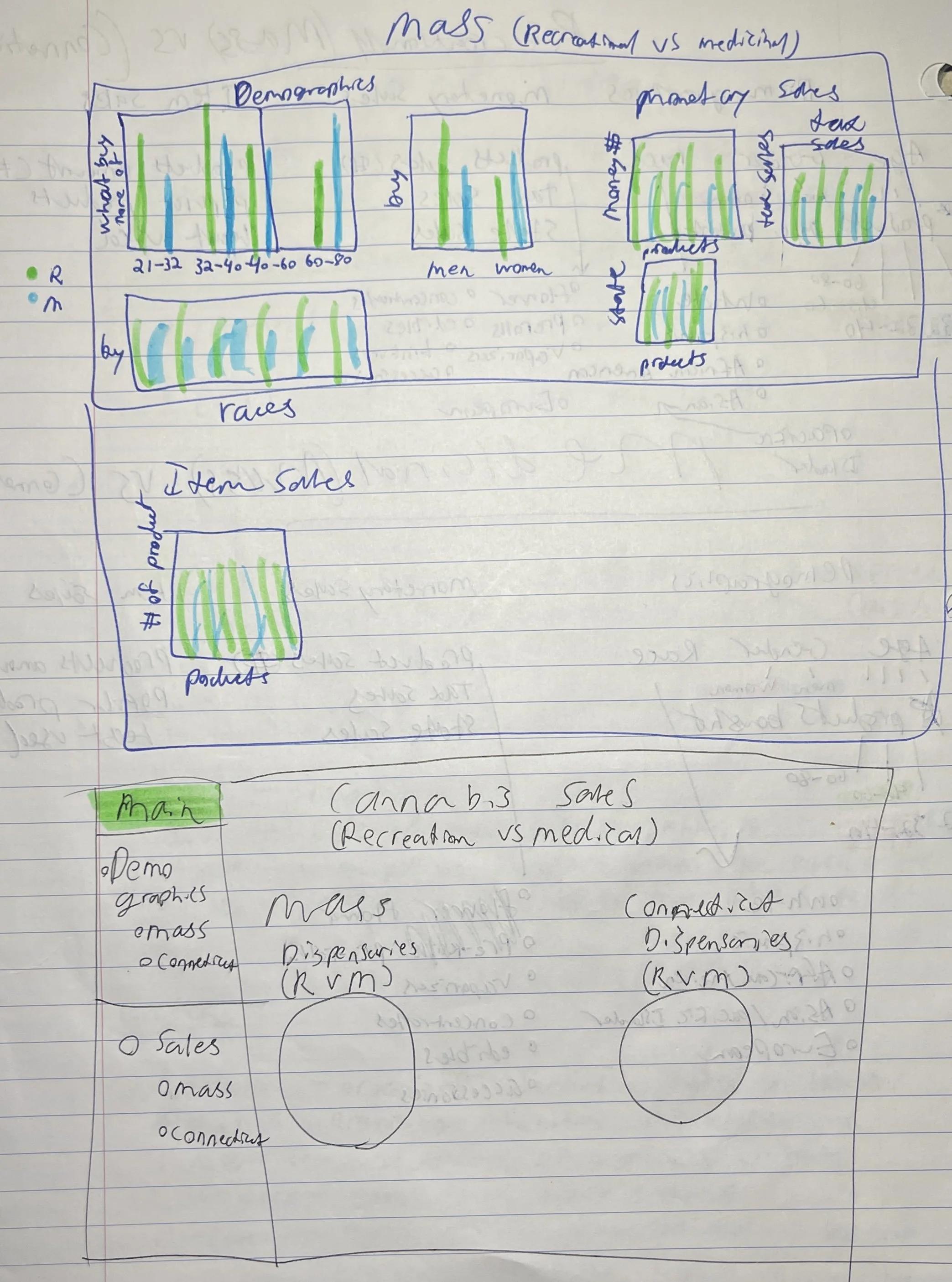
Initial Content Layout Sketches
For both medical and recreational cannabis, I wanted the content structure to feel consistent and easy to compare. When it came to demographics, I focused on a few key areas: age, gender, and ethnicity. These details helped paint a clearer picture of who is purchasing cannabis and for what purposes.
On the sales side, I looked at total revenue, including both tax income and raw state sales. I also broke down item-level data—how many products were sold, which types were the most popular, and which were used the least. The goal was to highlight not just how much is being sold, but what people are actually buying and how that varies across different regions and uses.

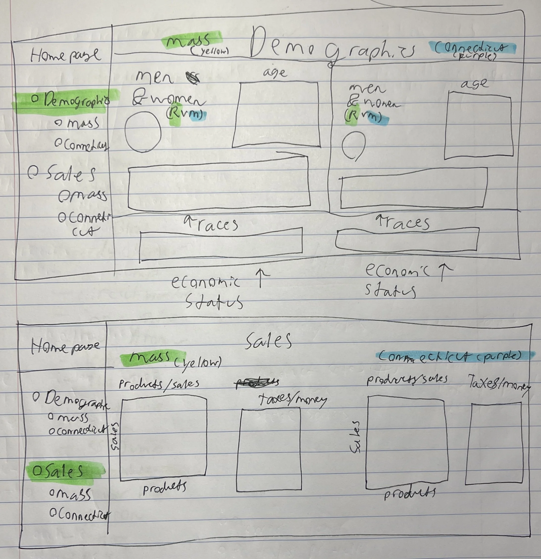
Layout Sketches for final prototype
The final step before moving into the digital phase of the project was developing layout sketches to visualize the structure of the dashboard. I explored several design approaches, including an initial layout that combined both demographic and sales data on a single page. However, this version felt overcrowded and lacked sufficient negative space, making it difficult to absorb the information comfortably.
To address this, I introduced a sidebar navigation element, which remained consistent throughout the final design. This sidebar provides quick access to the different content sections, creating a cleaner and more intuitive user experience. One design choice that remained constant was the inclusion of primary comparison charts, which served as visual anchors for analyzing data across states.
In the finalized sketches, the dashboard becomes more cohesive and user-friendly. The demographics page is clearly divided with design lines to separate data by state, making comparisons easier to interpret. For the sales pages, I narrowed the focus to two key charts per state—highlighting raw product sales and tax revenue generated from recreational cannabis. These visualizations were chosen to clearly communicate the financial and economic impact of legalization across regions.